In some forms of the cash register application, there are buttons for selecting an order and a visit. The appearance of the buttons can be changed using a special editor (called from the Model property of the Buttons with Orders object of the Forms directory), which is described in this chapter.
Button form editor window: 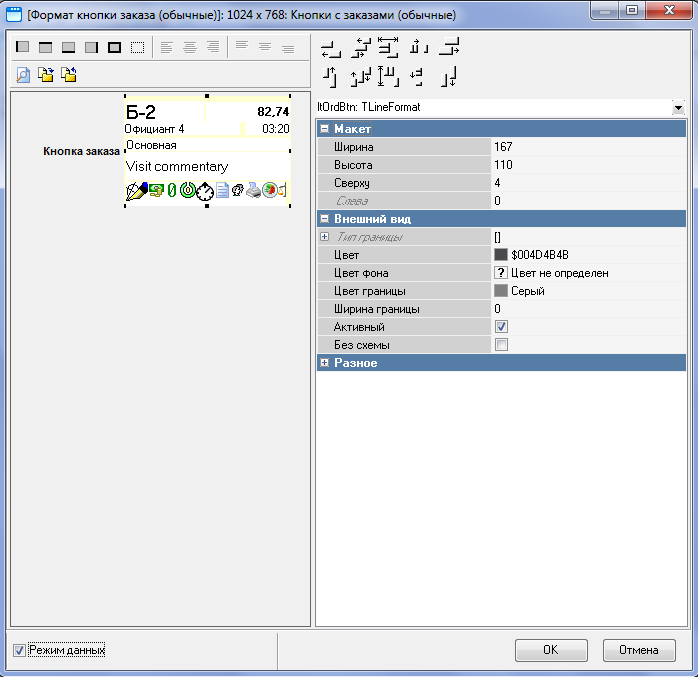
The button layout is a line of the "Order Button" object. You can add fields and images to the line using the Add Field and Add Image commands of the pop-up menu called from the line area, respectively.
For field-type objects, in the Field Name property, select the object property from the list that will be presented in the field. For picture-type objects, in the Picture property, select the image that will be displayed in this area.
A new field is added to the upper left corner of the line, then it is dragged to the desired location and the dimensions are set by dragging the object's border points or entering values in the Left and Top properties (Position group).
You can select an object using the mouse cursor or selecting a needed line from the list.
The Fields have the following properties:
Appearance Group
Border Type - a subgroup of properties responsible for drawing the left, right, top, and bottom lines of the frames that limit the object's field. The borders of the frames can be set and removed in the same way, using the buttons  on the toolbar.
Color – background color of the field;
At the end of the alphabetical list of palette colors are the placeholder colors defined in the color scheme. If your business uses color schemes, you should select the property values that define the background and font colors from this area of the palette.

Border Width – the thickness of the frame in pixels;
Border Color – border color;
The Font subgroup defines the font properties:
Bold – semi-bold;
Character encoding – setting the font type;
Color – font color;
Font Type – select the font type: Proportional or Fixed Size.
Format – determines how the field is displayed. For Date type fields, it can take the following values: Date, Date Time, Time.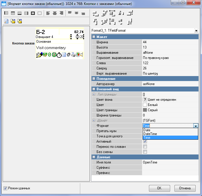
For fields of the Amount type, it can take the values Signed (+ or -), Unsigned.
Hide zeros – the flag set in this field allows you to hide insignificant zeros;
Visible - if you uncheck this flag, the object will become invisible;
Position Group:
Height – the height of the field in pixels;
Width – the width of the field in pixels;
Alignment – alignment of the field relative to the button boundaries;
Vertical Alignment – vertical alignment of text in the field: Top, Center, Bottom. You can use the toolbar buttons  to define this property;
Horizontal Alignment – horizontal alignment of the text in the field: Left, Center, Right. You can use the toolbar buttons  to define this property.
Left – the distance in pixels to the left border of the button layout;
Top – the distance in pixels to the top border of the button layout;
Data Group:
Field Name – select the variable displayed in the field;
Suffix - any characters displayed after the object type value;
Prefix – any characters that appear before the value of an object type;
Objects of the image type have a shortened list of the properties described above.
The layout can be worked with in either the "data" or "property designation" mode. Switching between modes is done using the Data Mode flag (bottom left). The button layout in the "property designation" mode:

 - preview of the layout.
 - save the created layout in .dfm file format (or the keyboard shortcut “Ctrl + S”).
 - load a layout from a file (or the keyboard shortcut "Ctrl + O").