Using this group of properties, the user can independently select a picture corresponding to the object, set the color scheme of the background and text, as well as the relative position of the picture and text.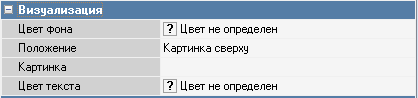 Background color – the color of the button. The color can be selected from the list or from the palette, which is called by double-clicking the left mouse button in the property value area;
Arrange Style – the relative position of the image and text;
Image – select an image for the object;
Text color – the color of the text. The color can be selected from the list or from the palette, which is called by double-clicking the left mouse button in the property value area.
You can see what the button image will look like at the checkout if you use the “Button view" mode (the Button view main menu item).
The assignments in this property group are in effect if the button on the selector form has the Sync flag set or the Default Selector Behavior is in effect.
Defining the color of screen form items:
А) If it is a function key, the visualization is specified in the Visualization property group of the function key (available from the Function Keys and Selectors directory);
В) If "Color not defined" is selected for the function key, the background and text color is taken from the color property of the button of the TSelector Panel component of the form on which the form button is located;
С) If you select the color "Forms: RK color ..." in this property, the color is taken from the used color scheme;
D) If a layout (custom form) is used for the selector page, then the color of the buttons is taken from the layout (directly from the description of the visualization of this button on the selector page layout);
Е) The visualization of the buttons with dishes is taken from the layout of the used selector page - if it exists, or from the dish property group "Visualization" if the standard delivery of the selector "Check: Main selector" is used.