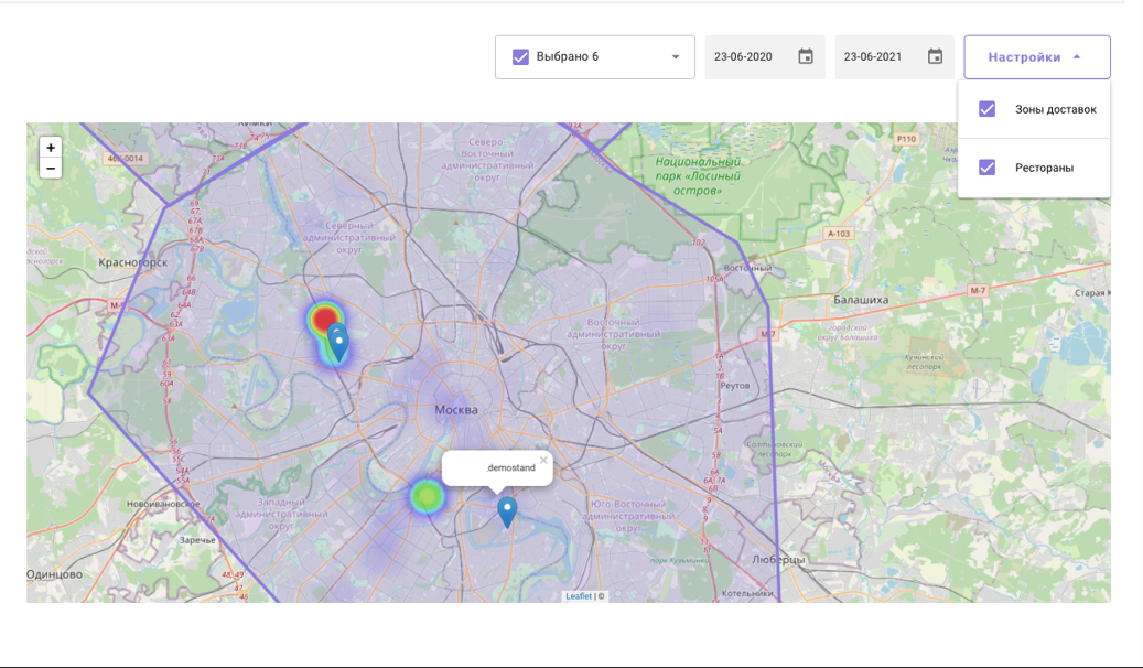
The report displays order distributions in a graphical format, where quantities are displayed using color.
Red color means there are a lot of orders, purple color means there are few.
To build the report:
- Go to Reports > Heatmap
- Specify the period and the required establishments
- In the report settings, specify the parameters that should be graphically displayed on the map. For example, delivery zones and restaurants.
Done. A heatmap will be generated based on the specified parameters.
When you click on a location pin  , the name of the establishment appears.